Overview
problem
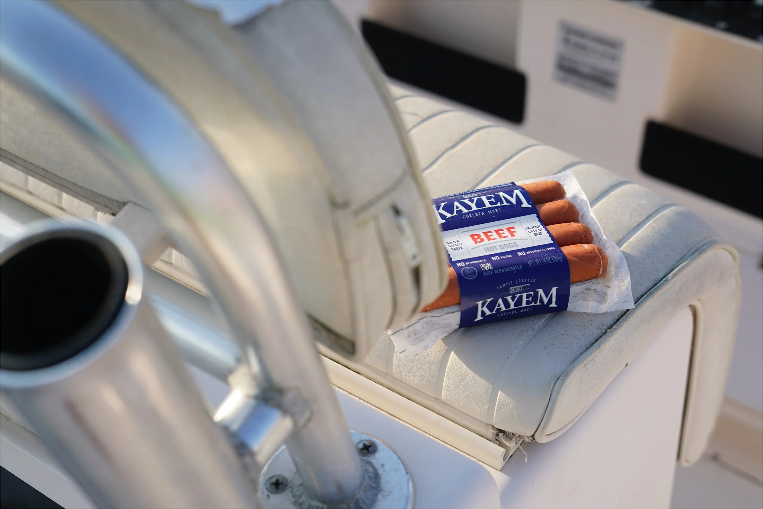
Kayem has been a hometown Boston brand since it’s inception in 1909. Now, they produce one of the most celebrated hot dogs in New England – the Fenway Frank. In 2017, they updated their product packaging, creating a gap in their messaging and visual identity.
solution
At Connelly Partners, my copy writer and I came up with a new campaign that brought the brand visually into the 21st century, while celebrating their rich history in meat craft and community. Featured in TV spots, Fenway Park and the brand’s online & social presence, we created Together We Grill.

Together We Grill
~
Together We Grill ~
Website Overhaul
This was my chance to show off their new campaign and visual identity while showing off their history. I also creating a direct-to-consumer checkout experience that highlighted all of their products and generated sales.
Mobile First
Since a lot of Kayem’s messaging is in Fenway Park, I wanted to make sure the website was designed mobile-first so that the entire experience was simple to navigate and engage with on-the-go.
Social Overhaul
With a campaign about togetherness, I wanted to create social campaigns that brought people together. A mix of lifestyle photos, infographics and UGC sweepstakes content gave us a range of touch points that could be produced quickly and keep the brand timely.
#ChoppingBlockTips
I designed this campaign to give a visual break from hot dogs. Working with a limited budget, this allowed me to source, art direct & shoot some of the unusual pairings that Kayem found during their 100+ years in the industry.
A few of my photos were used to jumpstart their social sweepstakes – where we asked consumers to submit photos of their hot dogs for a chance to win Red Sox tickets.
🌭
Brand Style Guide
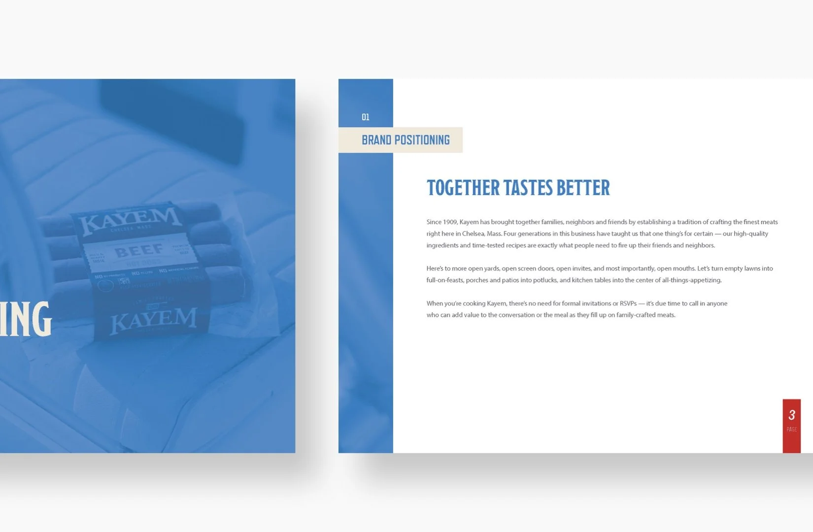
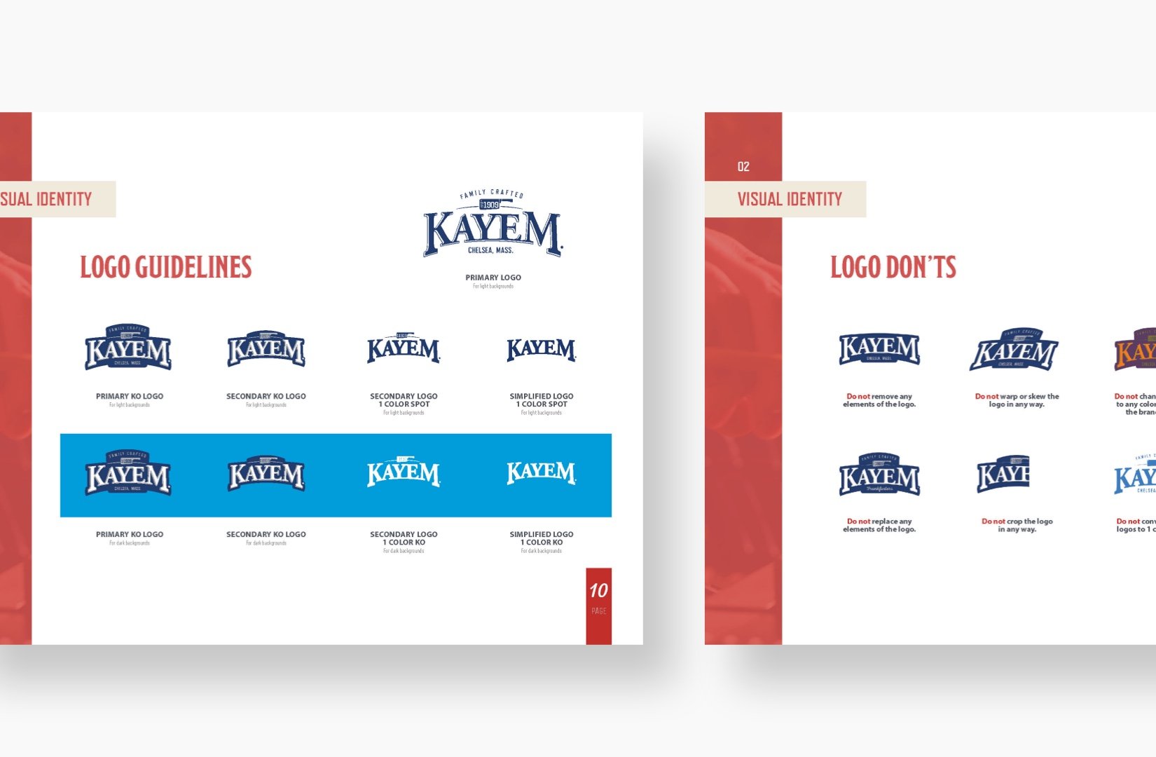
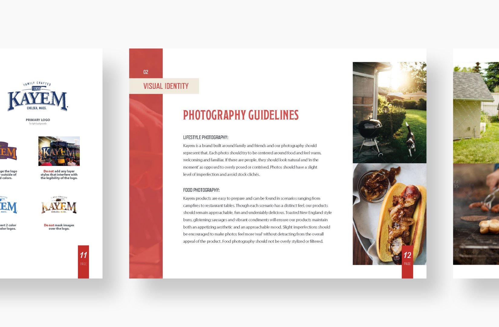
I created the Kayem Style Guide in 2018 to capture all of their recent brand work in a single document. This covered everything from the previous packaging work they had done, to the brand positioning and updated visual identity that me and my team created for them.
Creating this document meant breaking down all the elements of the brand – from traditional visual identity elements like fonts, colors and logos to photography styles, tone and voice. It also breaks down packaging into redlines and key characteristics of our target audience.


I also made an award-winning poster campaign with real hot dogs, ketchup & mustard.
AI could have saved me some late studio nights, but that wasn’t a thing yet and custom type & photography is fun too.


