Overview
problem
Hy Stor Energy is a clean-energy start up based out of Mississippi that focuses on hydrogen energy production, transportation and storage. Their goal is to minimize reliance on fossil fuels, by providing easy access to hydrogen energy for industry and consumers alike. However, without a brand identity they were unable to present themselves professionally to a global audience.
solution
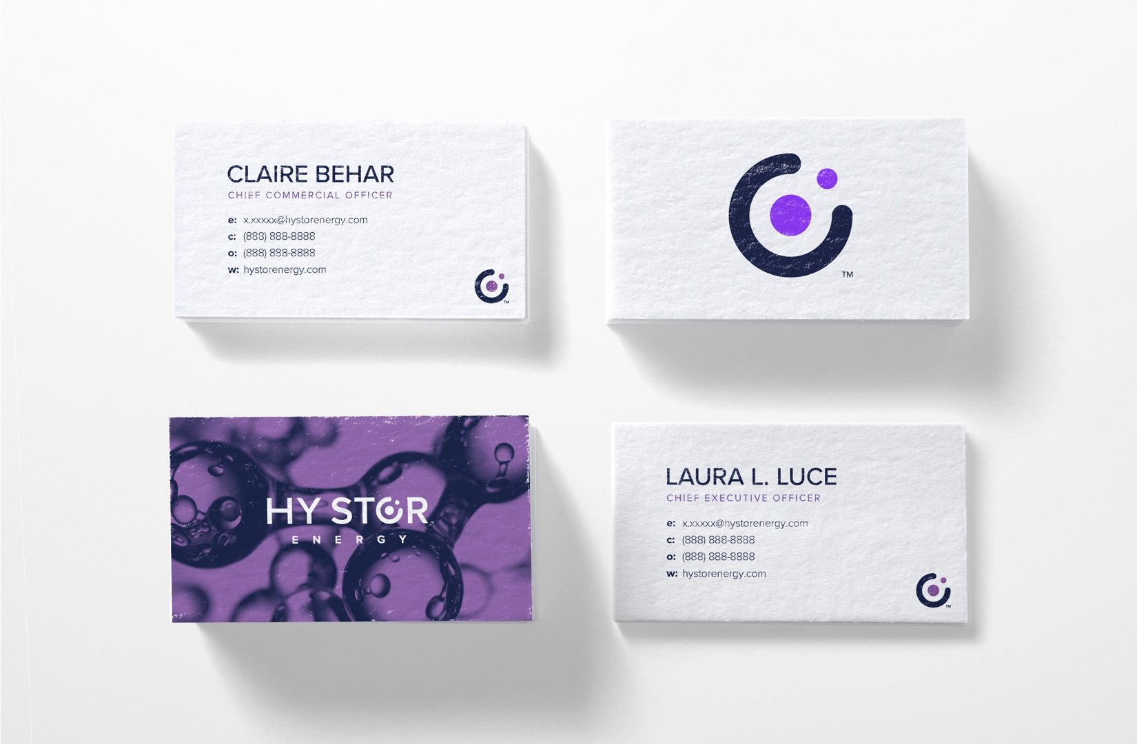
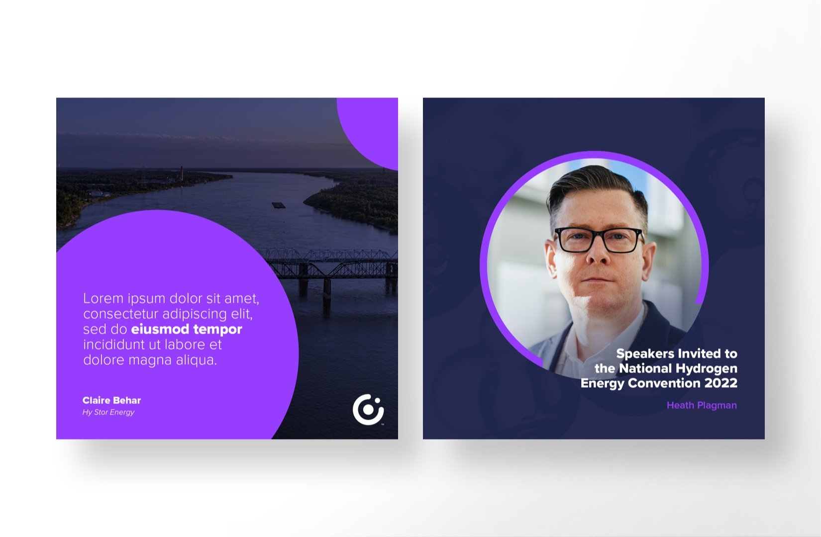
I was commissioned to brand the company and develop various marketing materials for their launch. This included presentation templates, letterhead, social media templates, business cards, zoom backgrounds and a suite of icons and illustrations to help shape their offering. All work adheres to AAA compliance testing so that the brand can be easily accessed and ingested by all audiences.


Brand Mark
Hydrogen is the most abundant chemical substance in the universe. The most common isotope of hydrogen consists of one proton, one electron, and no neutrons. The brand mark I created, aims to represent both the circling of two hydrogen atoms and the company’s ability to contain it.
Text Lockup
The brand mark was also designed to fit within the text lockup. With circles being such a prominent part of the brand mark, I wanted to add subtle rounding and flares to soften the text and make it unique, while still maintaining a strong tie to the brand’s core font.
Color
The vast majority of clean energy companies choose to use green, so I wanted to be drastically different – a new take on the entire sector. As such I chose a vibrant purple backed by a smooth navy to create a bright pop of color right in the logo. No matter the background the hydrogen element in the brand mark is designed to always stand out.
“Roland’s eye for design was key to the launch of Hy Stor Energy. His exceptional branding work laid a strong foundation for our global market presence. Roland’s creative vision has contributed to our ability to communicate our mission and values effectively, making him an indispensable part of our team.”
Claire Behar
Chief Commercial Officer
Hy Stor Energy
Maps
A large part of the Hy Stor story is proving that Hydrogen energy is a viable replacement for traditional energy solutions. This meant showing the infrastructure is capable of both producing enough energy but also the ability to deliver that energy efficiently to key markets. We worked in tandem to create pitch decks that help define key markets and the resources necessary to deliver to them.
Iconography
A robust icon set was produced to help define key presentation points. Some of the key value propositions included the company’s goals to provide energy internationally, their dedication to working with local communities to provide jobs and transparency during development and the overall monetization plan for the infrastructure they develop.
Technical Illustrations
Iconography isn’t always enough when describing new technologies that the company relies on to operate. As such I was tasked with developing more technical illustrations for use in pitch decks. These included electrolyzer, transportation and delivery systems, geothermal wells and underground storage solutions.


Growing with
the brand.
The Hy Stor team also contracted me to brand their facilities, dubbed Clean Hydrogen Hubs. Though Hy Stor Energy remains the core brand, their facilities – popping up in strategic locations around the US – needed an iterative logo to bring them together under the same name. To keep a strong tie to the original Hy Stor branding, I maintained the same color scheme and typography, but created a new logo set that’s versatile enough to represent any future locations that might pop up down the line.
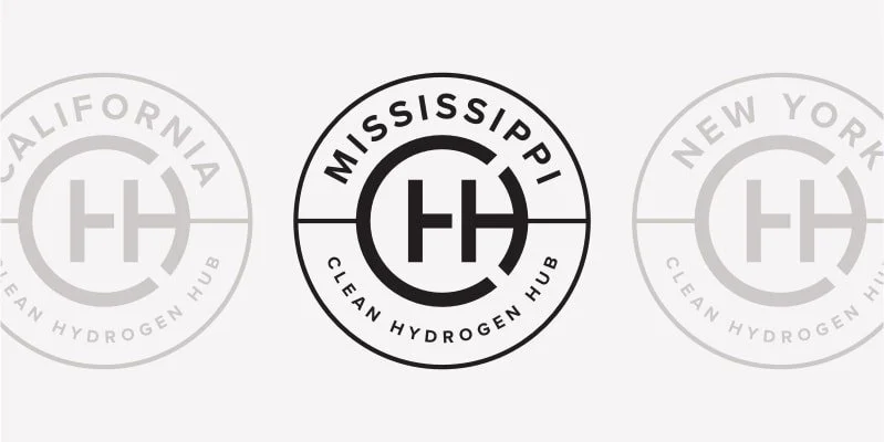
Starting off with Mississippi, the Mississippi Clean Hydrogen Hub logo design was created. This logo needed to have a branded element for the Clean Hydrogen Hub – CHH – while providing the ability to show the specific location. These logos would be used to brand the facility itself along with any merchandise that employees might need to wear while performing their duties on location.
Core Logo Mark
The core logo mark of the Clean Hydrogen Hub uses the C + H + H to create a modern monogram that puts the primary emphasis on H – for hydrogen. By branding the hubs, independently of the specific location, we are able to create brand equity in the company’s core offering – clean hydrogen.
Location Badges
Expanding the core logo mark to address specific locations came with it’s own share of problems to solve. For one, Mississippi is the one of the longest US state names and Clean Hydrogen Hub isn’t exactly short either. A badge wound up being the most efficient way of integrating all of the text within a single logo, while maintaining the flexibility to add new locations as they arise.
Text Marks
The text marks offer the highest level of legibility for smaller logo placements. This mark is especially helpful as a 2 color logo as it helps add emphasis to the specific location. Much like the Hy Stor Energy logo mark, the color scheme allows for emphasis on a particular element regardless of the background color.


