Overview
problem
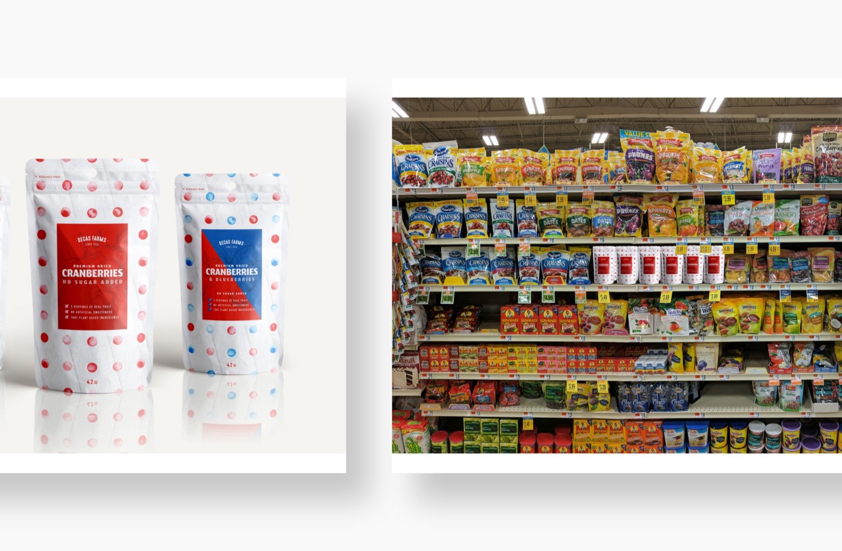
Decas Farms developed a healthier and more naturally delicious (yes, I ate my fair share and can verify) version of their standard dried cranberries and needed a splashy way of bringing them to market. Their leading competitor is a household name and they wanted new packaging for this product line to help refresh their brand and stand out on the shelf.
solution
Beyond introducing the product to market, my focus was in modernizing the brand, without going too far from where they were. This product had to coexist along side the old packaging, until the company had money to complete the lineup. Familiar elements like the background texture, call back to their old designs, while simple patterns and bold colors help position the brand as a premium snack – not your everyday cranberries.
Logo Updates
A quick simplification to the shape, turned the logo from a 3-color to a single or 2 color option. The elimination of the banner helps with legibility and cleans up the overall look.
Apothecary-Style Illustrations
Cranberry farming is a family business and they take it seriously. With the new packaging taking a turn for the playful, I wanted to make sure we still conveyed their deep understanding of the product.
Sister Packaging Analysis
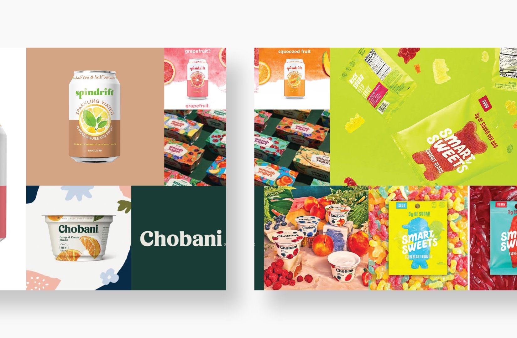
In looking at the old packages, I found that the product looked very similar to all of the competition. Photos of cranberries seemed to be the common trend so I knew I wanted to try an option that had none.
Color & Shape Inspiration
The colors arose from the proposed product line - Cranberries, with or without Mangoes or Blueberries. Simple shapes gave the boldness I was looking for and helped the product stand out on the shelf.
Reusing Old Textures
In the background of the old package was this wooden texture that I felt did a good job of harkening back to the organic and farmer-owned nature of the business.
Pattern Development
I wanted to convey the fruits without photography, so I landed on simple water color shapes. Small adjustments to their shape and color started making the package feel premium and special.
Alternate Options
-

Option 1
An evolution of the current packaging, this option celebrates the brand’s honest approach to snacking by using food photography and watercolor inspired by the fruit’s juice.
-

Option 2
A mixture of modern type and hand-drawn elements, this option pulls inspiration from farmer’s market signs and traditional watercolor still life. When paired with ample white space the effect is contemporary, but with a classic, artisan feel.
-

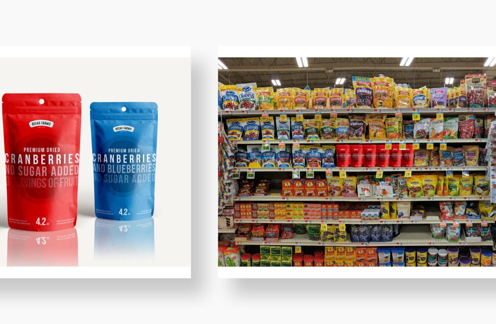
Option 3
A bit of a departure from the rest, this option uses bold type and vibrant color to stand out. There is bravery in simplicity.


